Case Studies
Case Study #1
CLIENT
BloomNation (Promenade Group)
TYPE
Ad Campaign: Established Florists
BACKGROUND
BloomNation is an e-commerce platform that provides tools for local florists all of the US with an SEO-optimized website, point-of-sale, and other marketing solutions (like email marketing).
BRIEF
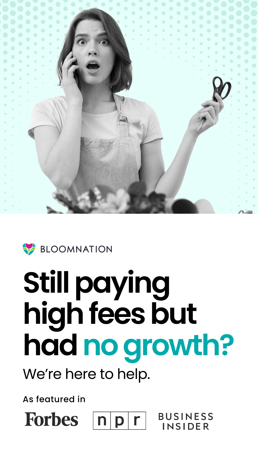
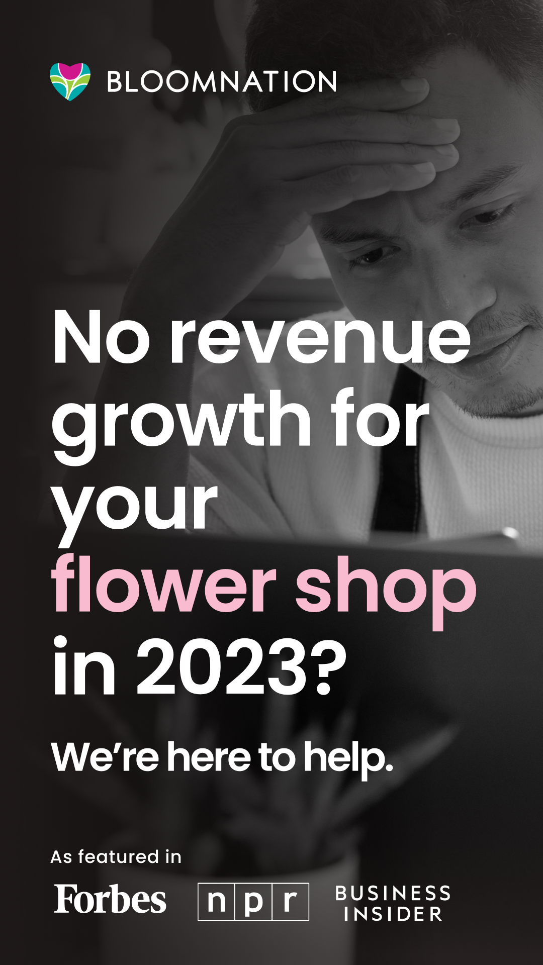
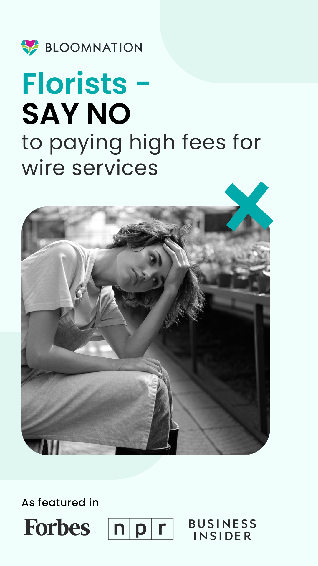
The objective was to develop a powerful ad campaign aimed at empowering ‘established florists’ (florists that make over a certain amount of revenue) to take full control of their online presence and break free from wire services. Wire services like Teleflora send orders online to local florists but in the background, while the florist carries out the order and does all the word - their name does not carry through tot he customer and their brand is hidden behind the wire service. BloomNation offers florists a way to feature themselves to get their own name out there with their own SEO-optimized website. SEO played a big part in getting more orders from customers searching for flower delivery on google.
DESIGN DECISIONS
Many of these florists are true creatives and artists which led me to take a more playful graphic approach. I incorporated these flat graphic elements to make the images pop and to attract attention. I also selected images of people that looked like real florists. 77% of florists are women so a majority of the stock imagery I chose reflected that demographic. I incorporated the brand colors from the BloomNation branding book and the matching fonts. I included stats, bolded words, and big shapes to communicate the ideas that BloomNation is helping these florists grow. The philosophy at BloomNation was that it’s a win-win situation for both BloomNation AND the florist because of the revenue share.



Case Study #2
CLIENT
Gerber Life Insurance
TYPE
Icon Set
BRIEF
Create around 40 icons that match the ‘story lines’ visual identity.
More on the Icon System Background
Our icon system is designed to feel at home alongside our Story Lines. Each icon uses a single, consistent line weight and generous open space to create clarity and warmth at every size. Their simple connection points echo the gentle loops and transitions in our Story Lines, giving the entire system a unified, human touch. Together, these icons bring clarity and consistency to our communications while supporting the friendly, grounded character of our brand.
CONSTRAINTS
Match the icon styles to the icon system visual identity. Icons should not have too much detail and should be easy to see from a distance because they are a small size. Fit the new icons into the same pixel ratio as the existing icons.