Case Study #1
Well Chosen - An Editorial Publication & Digital Experience
Well Chosen is a concept for a digital editorial publication that explores the intersection of design, fashion, architecture, and intentional living. Rather than encouraging readers to consume more, the publication celebrates thoughtful ownership, enduring craftsmanship, and the philosophy of choosing fewer things that matter more.
The Brief
Create the brand identity and user interface for an online publication that inspires readers to live with greater intention. The publication should feel editorial rather than commercial, balancing thoughtful storytelling with elevated visual design. Content would span fashion, interiors, travel, culture, and craftsmanship through the lens of quality over quantity.
Design Decisions - homepage
Because this is a personal project, I wanted to develop a ‘philosophy-first brand’ that would guide all of my design decisions. Instead of organizing the publication around products, I centered it around ideas first. Articles explore concepts like intentional living, craftsmanship, curiosity, and longevity, using fashion, architecture, and design as entry points into broader conversations.
First I started with the home page (left). I created a banner image to capture the reason why Well Chosen exists. The first message on the banner clearly states what the focus of Well Chosen is. It’s all about intentional living in a world of fast-fashion and clutter. It’s about carefully selecting the things we invite into our life.
The next section features popular articles with a heading, subheading, and an image related to the article.
The following section is less about physical items, and more about the intentional living and life advice aspect.
The final section, “The Words We Live By” illustrates the set of values this publication is built on.
Click on image to englarge!
Design Decisions - the ‘wear’ page'
The focus of the wear page would be to feature a modern icon that demonstrates the set values I described above. Tomo Miyamoto, while a totally fabricated person, is a stand-in for this particular example. This would be a well known person in the design/lifestyle/creative community. This section serves to break down some of his top outfit choices and illustrate use cases for these clothing items.
I imagined that this figure would have his own branding - so I crafted a repeating section with his logo for brand recognition and featured his image in fullbody wearing a nice outfit in the hero image.
The Outfit Breakdown
I thought it would be interesting to show an inspiring flatlay of his outfits in more of a large-scale spread. I also wanted to give full details about the outfit and a little description about where Tomo would wear this. I made sure to include colorful clothing that wasn’t too overpowering or bright. This is a more subtle, reserved style I’m featuring here and reflects the laid-back and calm nature of this publication. This isn’t targeting men in their party days, it’s targeting men who favor classic style, men who are searching for more meaning in life, and are calming down in their lifestyle.
Case Study #2
BloomNation - Ad Set
BloomNation is an e-commerce platform that provides tools for local florists all over the US with an SEO-optimized website, point-of-sale, and other marketing solutions.
Brief
The objective was to develop a powerful ad campaign aimed at empowering ‘established florists’ (florists that make over a certain revenue amount) to take full control of their online presence and break free from reliance on wire services. Wire services like Teleflora send orders online to local florists but in the background, while the florist carries out the order and does all the work - their name does not carry through to the customer and their brand is hidden behind the wire service. BloomNation offers florists a way to feature themselves and get their own name out there with their own SEO-optimized website. SEO played a big part in getting more orders from customers searching for flower delivery online.
Design Decisions
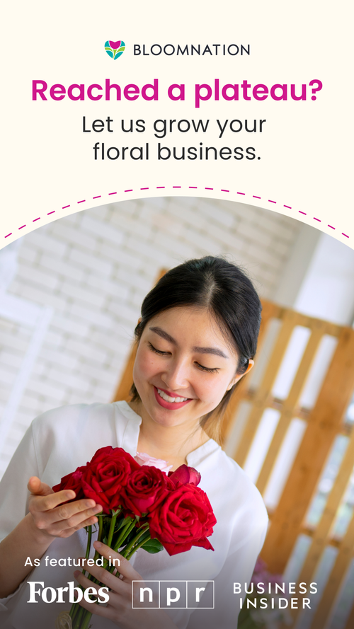
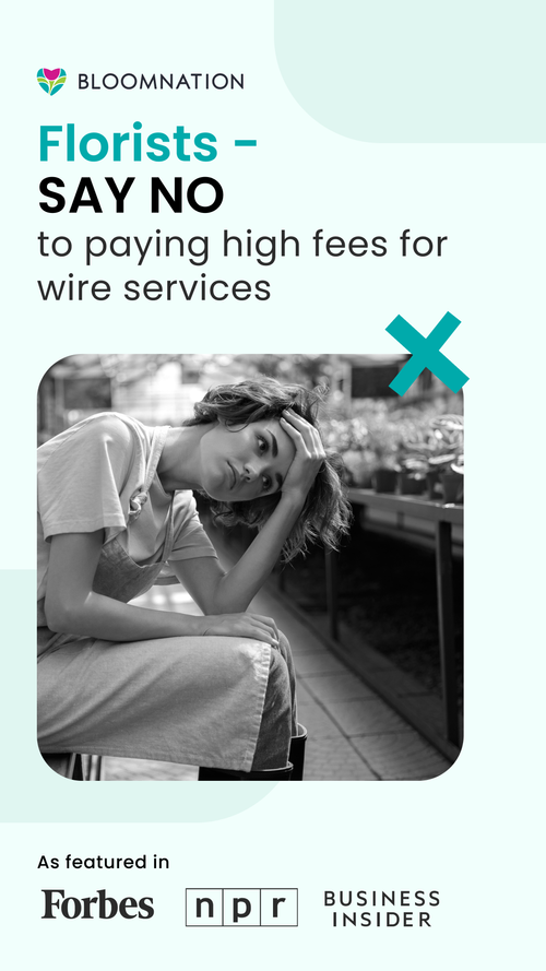
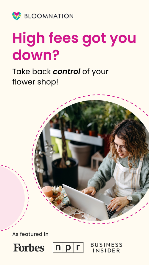
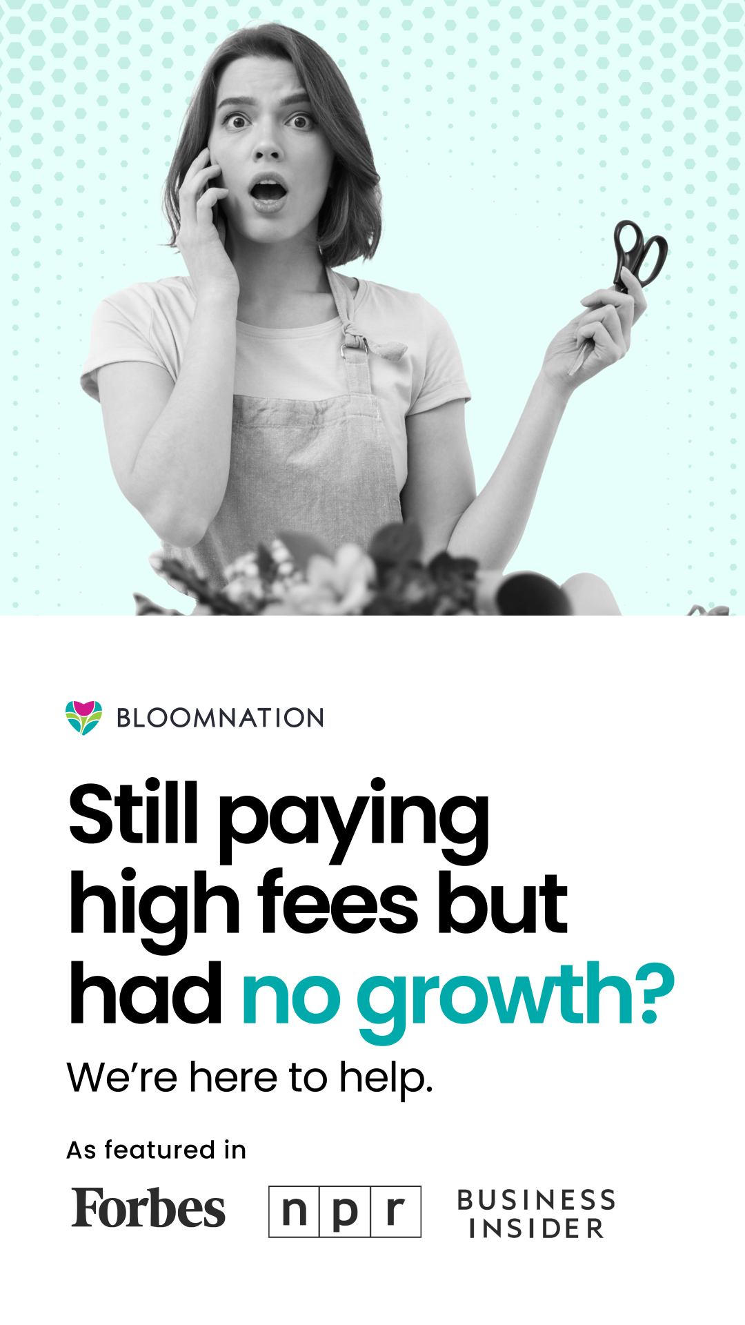
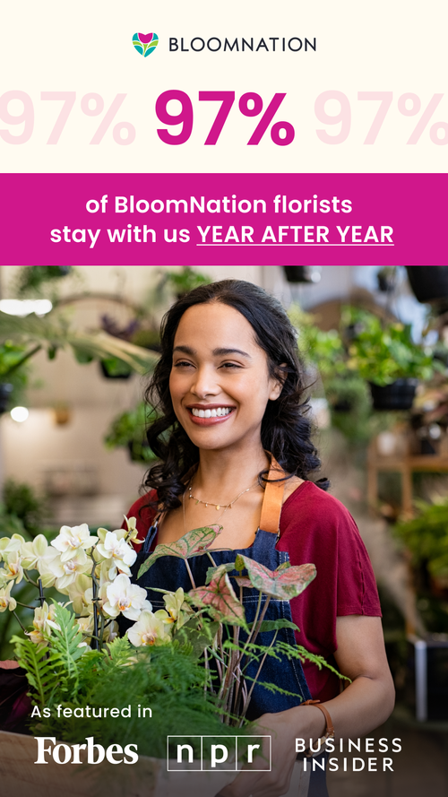
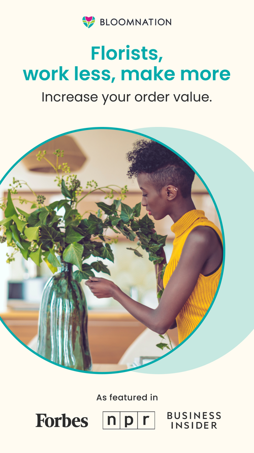
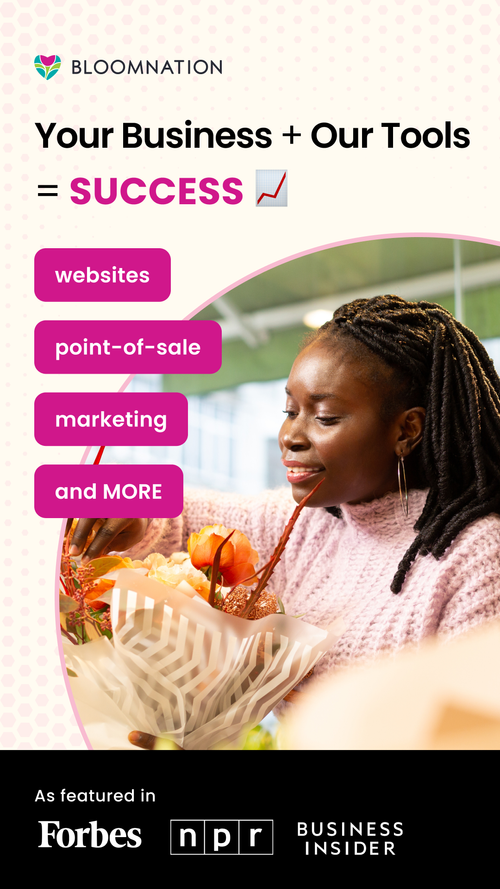
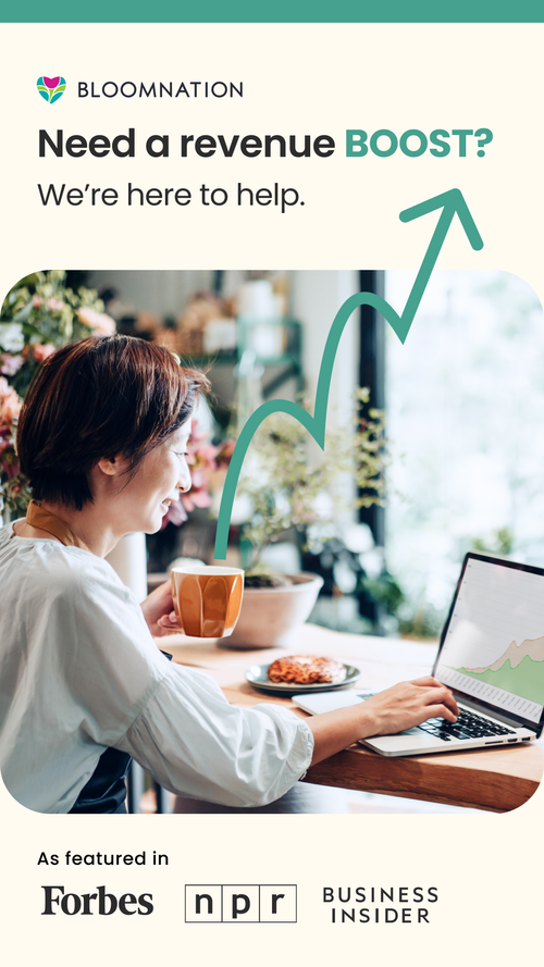
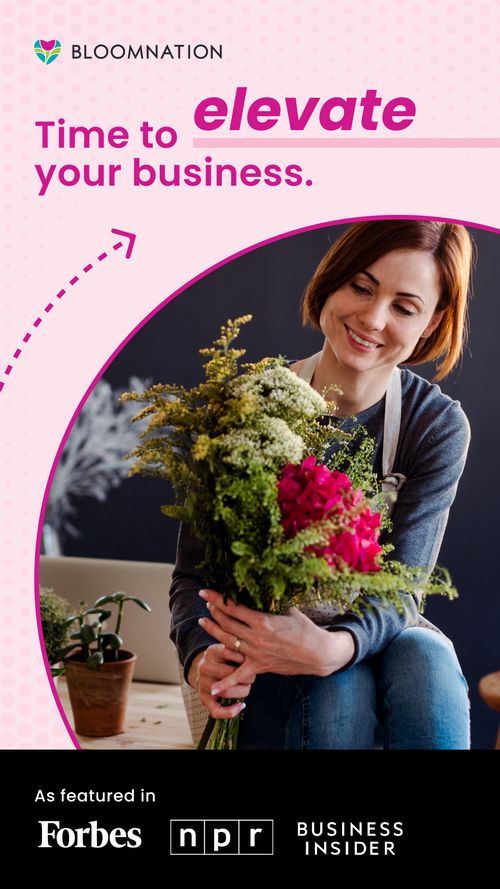
Many of these people are true creatives and so I took a more playful graphic approach. I incorporated these flat graphic elements to make the images pop and to attract attention. I also selected images of people that looks like real florists. 77-78% of florists are women so a majority of the images reflected that demographic. I incorporated the brand colors from the BloomNation branding book and the matching fonts. I included stats, bolded words, and big shapes to communicate the ideas that BloomNation is trying to help these florists grow. The philosophy at BloomNation was that it’s a win-win situation for everyone involved.
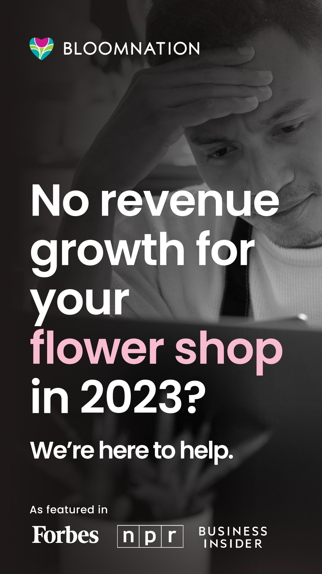
I worked with the CEO, copywriter, and marketing director. I was responsible for the full design and the rest of the team spent more behind the scenes related to the copy. We set out to do A/B testing and I was asked to create a set of more ‘negative’ ads and a set of ‘positive’ ads. For example, the black and white image you see below that says “No revenue growth for your flower shop in 2023?” was part of the negative set of ads. It was meant to be more alarming and serious. We wanted to test which set performed better. Both the copy and the imagery reflected these positive/negative aspects. It’s important to do testing like this in your ad sets because you might be surprised at what grabs your viewer’s attention.